

Modal
The Modal component is a flexible and customizable dialog used to display content over the main UI of your application.
To provide greater control, Modal supports multiple slots, allowing you to override the default overlay and modal window structure with your own content and styles.
Using the Modal component is simple. You can import it and incorporate it into your app as shown below:
import Modal from '@components/Basic/Modal/Modal';import ModalCloseIcon from '@components/Basic/Modal/ModalCloseIcon.svg?component-solid';import Block from '@components/Layout/Block/Block';import Flex from '@components/Layout/Flex/Flex';import Top from '@components/Layout/Top/Top';import Content from '@components/Layout/Content/Content';import Bottom from '@components/Layout/Bottom/Bottom';import Button from '@components/Basic/Button/Button';
const App = () => {    return (        <Modal open>            <Modal.Overlay style={{ background: 'rgba(0, 0, 0, 0.5)' }} />            <Modal.Window>                <Top>                    <Flex justify-content='space-between' align-items='center'>                        <Block>Modal title</Block>                        <Modal.Close style={{ width: '2vmax', height: '2vmax' }}>                            <ModalCloseIcon />                        </Modal.Close>                    </Flex>                </Top>                <Content>                    Content                </Content>                <Bottom>                    <Flex justify-content='end'>                        <Modal.Close style={{ "margin-right": '0.5vmax' }}>                            <Button size='small' textFit={false}>Accept</Button>                        </Modal.Close>                        <Modal.Close>                            <Button size='small' textFit={false}>Reject</Button>                        </Modal.Close>                    </Flex>                </Bottom>            </Modal.Window>        </Modal>    );};
export default App;| Prop | Type | Default | Description |
|---|---|---|---|
style | JSX.CSSProperties | {} | Inline styles applied to the modal’s root element. |
class | string | "" | Additional CSS classes to customize the modal’s appearance. |
ref | ModalRef | undefined | undefined | Reference to the modal instance. You can use it to call methods like open() or close() programmatically. |
open | boolean | false | Determines whether the modal is initially visible. |
Methods
Section titled “Methods”| Method | Parameters | Returns | Description |
|---|---|---|---|
open() | - | void | Opens the modal programmatically. |
close() | - | void | Closes the modal programmatically. |
isOpen() | - | boolean | Returns true if the modal is currently open; otherwise, returns false. |
Modal.Overlay
Section titled “Modal.Overlay”This slot lets you define the modal’s background overlay. Use it to enable or customize the overlay that appears behind the modal window.
Properties
Section titled “Properties”| Prop Name | Type | Default | Description |
|---|---|---|---|
style | JSX.CSSProperties | {} | Inline styles applied directly to the overlay element. |
class | string | "" | CSS classes for additional overlay styling. |
import Modal from '@components/Basic/Modal/Modal';
const App = () => {    return (        <Modal open>            <Modal.Overlay style={{ background: 'rgba(0, 0, 0, 0.5)' }} />        </Modal>    );};
export default App;
Modal.Window
Section titled “Modal.Window”Use this slot to define and customize the modal window itself. This is where you place your dialog content.
Properties
Section titled “Properties”| Prop Name | Type | Default | Description |
|---|---|---|---|
style | JSX.CSSProperties | {} | Inline styles for the modal window. |
class | string | "" | Additional CSS classes for custom styling. |
children | JSX.Element | "" | Content to be displayed inside the window. |
import Modal from '@components/Basic/Modal/Modal';
const App = () => {    return (        <Modal open>            <Modal.Window style={{ background: 'red' }}>                Content and structure of the modal dialog goes here.            </Modal.Window>        </Modal>    );};
export default App;
Modal.Close
Section titled “Modal.Close”The Modal.Close slot is used to wrap any element that should trigger the closing of the modal when clicked. This is typically a button or an icon, but it can be any clickable element. The slot can be placed anywhere inside the modal window and used multiple times if needed.
Properties
Section titled “Properties”| Prop Name | Type | Default | Description |
|---|---|---|---|
style | JSX.CSSProperties | {} | Inline styles for the close button. |
class | string | "" | Additional CSS classes for styling the close button. |
children | JSX.Element | "" | Content rendered inside the button (e.g., text, icon, or custom component). |
import Modal from '@components/Basic/Modal/Modal';import Button from '@components/Basic/Button/Button';
const App = () => {    return (        <Modal open>            <Modal.Window style={{ background: 'red' }}>                <Modal.Close>                    <Button size='small' textFit={false}>Close</Button>                </Modal.Close>            </Modal.Window>        </Modal>    );};
export default App;Customizing the Modal Window
Section titled “Customizing the Modal Window”By default, the Modal.Window slot provides a basic layout - a white background with no predefined content. This minimalist setup allows you to fully customize the modal window according to your needs. You can insert any content within Modal.Window, including text, buttons, or other components.
To help structure the modal’s layout, you can use the Top, Content, and Bottom components. These subcomponents make it easier to build consistent and flexible modal designs by organizing the content into clear sections.
Refer to the first example on this page for a demonstration of how to use these components.
Creating a Modal with a Background Behind the Content
Section titled “Creating a Modal with a Background Behind the Content”To add a background specifically behind the content of a modal, you can again use the Top, Content, and Bottom components for structure. Use Top for titles or headers and Content for the main area of the modal.
To customize the content background, apply a background image or color to the Content component. Then, remove the Modal.Window background by setting its style to none.
import Modal from '@components/Basic/Modal/Modal';import Button from '@components/Basic/Button/Button';import Modal from '@components/Basic/Modal/Modal';import ModalCloseIcon from '@components/Basic/Modal/ModalCloseIcon.svg?component-solid';import Block from '@components/Layout/Block/Block';import Flex from '@components/Layout/Flex/Flex';import Top from '@components/Layout/Top/Top';import Content from '@components/Layout/Content/Content';import Bottom from '@components/Layout/Bottom/Bottom';import Button from '@components/Basic/Button/Button';
const App = () => { return ( <Modal open> <Modal.Overlay /> <Modal.Window style={{ background: 'none' }}> <Top> <Flex align-items='center'> <Block style={{ color: 'white', "text-align": 'center', flex: '1 0 0' }}>Modal title</Block> <Modal.Close style={{ width: '2vmax', height: '2vmax' }}> <ModalCloseIcon /> </Modal.Close> </Flex> </Top> <Content style={{ color: 'white', background: 'url(./content-bg.svg)', height: '17vmax', padding: '2.5vmax 8vmax', 'background-repeat': 'no-repeat', 'background-size': '100% 100%', }} > Content </Content> </Modal.Window> </Modal> );};
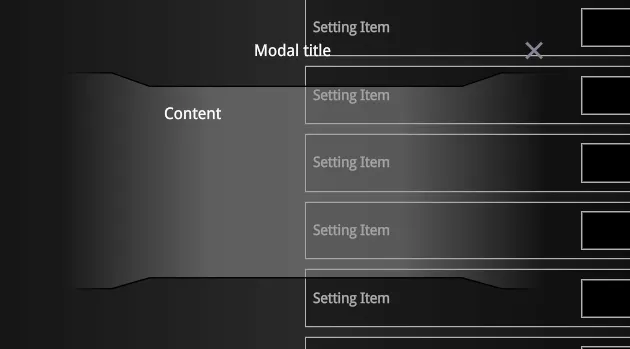
export default App;In this example, the background of the Content section is set to an image: ./content-bg.svg:

The result will appear as follows:
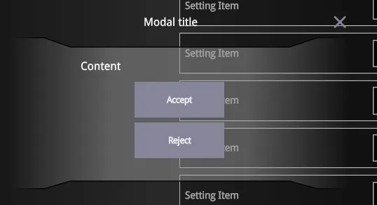
Adding Controls Inside the Modal Content
Section titled “Adding Controls Inside the Modal Content”You can enhance the previous example by adding close buttons directly within the modal’s content. Since the Modal.Close slot can be used multiple times, it’s perfectly fine to place close buttons inside the Content area.
import Modal from '@components/Basic/Modal/Modal';import Button from '@components/Basic/Button/Button';import ModalCloseIcon from '@components/Basic/Modal/ModalCloseIcon.svg?component-solid';import Block from '@components/Layout/Block/Block';import Flex from '@components/Layout/Flex/Flex';import Top from '@components/Layout/Top/Top';import Content from '@components/Layout/Content/Content';import Bottom from '@components/Layout/Bottom/Bottom';import Button from '@components/Basic/Button/Button';
const App = () => {    return (        <Modal open>            <Modal.Overlay />            <Modal.Window style={{ background: 'none' }}>                <Top>                    <Flex align-items='center'>                        <Block style={{ color: 'white', "text-align": 'center', flex: '1 0 0' }}>Modal title</Block>                        <Modal.Close style={{ width: '2vmax', height: '2vmax' }}>                            <ModalCloseIcon />                        </Modal.Close>                    </Flex>                </Top>                <Content                    style={{                        color: 'white',                        background: 'url(./content-bg.svg)',                        height: '17vmax',                        padding: '2.5vmax 8vmax',                        'background-repeat': 'no-repeat',                        'background-size': '100% 100%',                    }}                >                    Content                    <Flex direction='column'>                        Content                        <Flex align-items='center' direction='column' style={{ "margin-top": '1vmax' }}>                            <Modal.Close style={{ "margin-bottom": '0.5vmax' }}>                                <Button size='small' textFit={false}>Accept</Button>                            </Modal.Close>                            <Modal.Close>                                <Button size='small' textFit={false}>Reject</Button>                            </Modal.Close>                        </Flex>                    </Flex>                </Content>            </Modal.Window>        </Modal>    );};
export default App;
You can also attach click handlers to the Accept and Reject buttons to trigger specific actions when modal closes:
<Button click={() => console.log('Accepted')} size='small' textFit={false}>Accept</Button>The end result will look like this:
Opening and Closing the Modal Programmatically
Section titled “Opening and Closing the Modal Programmatically”The Modal component also allows you to control its state through code.
- Create a ref of type
ModalRefand bind it to theModalcomponent. - Use
ref.open()andref.close()methods to toggle the modal programmatically (e.g., via keyboard or external UI control).
import Modal, { ModalRef } from '@components/Basic/Modal/Modal';import ModalCloseIcon from '@components/Basic/Modal/ModalCloseIcon.svg?component-solid';import Block from '@components/Layout/Block/Block';import Flex from '@components/Layout/Flex/Flex';import Top from '@components/Layout/Top/Top';import Content from '@components/Layout/Content/Content';import Bottom from '@components/Layout/Bottom/Bottom';import Button from '@components/Basic/Button/Button';import { onMount } from 'solid-js';
const App = () => {    let ref!: ModalRef;
    const handleKeyDown = (e: KeyboardEvent) => {        if (e.keyCode === 13 && ref.isOpen()) {            ref.close();        }    };
    onMount(() => {        window.addEventListener('keydown', handleKeyDown);        return () => window.removeEventListener('keydown', handleKeyDown);    });
    return (        <>            <Button click={() => ref.open()} size='small' textFit={false}>Open modal</Button>            <Modal ref={ref}>                <Modal.Overlay style={{ background: 'rgba(0, 0, 0, 0.5)' }} />                <Modal.Window>                    <Top>                        <Flex justify-content='space-between' align-items='center'>                            <Block>Modal title</Block>                            <Modal.Close style={{ width: '2vmax', height: '2vmax' }}>                                <ModalCloseIcon />                            </Modal.Close>                        </Flex>                    </Top>                    <Content>                        Content                    </Content>                    <Bottom>                        <Flex justify-content='end'>                            <Modal.Close style={{ "margin-right": '0.5vmax' }}>                                <Button size='small' textFit={false}>Accept</Button>                            </Modal.Close>                            <Modal.Close>                                <Button size='small' textFit={false}>Reject</Button>                            </Modal.Close>                        </Flex>                    </Bottom>                </Modal.Window>            </Modal>        </>    );};
export default App;