

Carousel
The Carousel component is a flexible and feature-rich solution for displaying a series of items in a sliding format. It offers support for features like pagination, navigation controls, and customizable item slots, making it ideal for showcasing images, cards, or other content in a carousel layout.
This component is built using foundational elements, including:
- Pagination for rendering pagination controls.
To use the Carousel component, simply import it and include it in your JSX. You can customize it with various props and slots to suit your specific requirements.
import { For } from 'solid-js';import Flex from '@components/Layout/Flex/Flex';import Carousel from '@components/Complex/Carousel/Carousel';
const App = () => {    const items = ['Item 1', 'Item 2', 'Item 3', 'Item 4', 'Item 5'];
    return (        <Carousel style={{ width: '30vmax' }} itemWidth={40} itemGap={5} itemsAlignment='center'>            <Carousel.Items style={{ height: '80%' }}>                <For each={items}>                    {(item) =>                        <Carousel.Item                            style-selected={{ transform: 'scale(1.1)', border: '0.2vmax solid #868599' }}                            style={{ overflow: 'hidden', transition: 'transform 300ms', 'border-radius': '1vmax' }}                        >                            <Flex align-items='center' justify-content='center' style={{ background: '#3e3d5d', height: '100%' }}>                                {item}                            </Flex>                        </Carousel.Item>}                </For>            </Carousel.Items>            <Carousel.Pagination />        </Carousel>    );};
export default App;Carousel Props
Section titled “Carousel Props”| Prop Name | Type | Default | Description |
|---|---|---|---|
style | JSX.CSSProperties | {} | Inline styles to apply directly to the carousel’s wrapper element. |
class | string | "" | Additional CSS classes to apply to the carousel’s wrapper element. |
ref | CarouselRef | undefined | undefined | A reference to the component, providing access to its methods and the underlying HTML element. |
itemWidth | number | 100 | Specifies the width of each carousel item as a percentage. This determines how wide each item will appear within the carousel. |
itemGap | number | 0 | Defines the gap between carousel items as a percentage. This determines the spacing between items in the carousel. |
itemsAlignment | 'start' | 'center' | 'end' | start | Controls the alignment of items within the carousel. Options include start, center, and end, which determine how items are aligned along the main axis of the carousel. |
groupItems | boolean | false | When set to true, groups items together based on the itemWidth and itemGap values, enabling a page-like display where multiple items are shown at once. |
leadingAndTrailingSpaces | boolean | true | Determines whether to add leading and trailing spaces to the items. Setting this to false creates a more compact layout without extra padding on the sides. |
onAction | Record<string, (scope?: string, ...args: any[]) => void> | undefined | Allows you to add custom navigation action handlers to the carousel. See the Navigation component documentation for details. |
anchor | string | HTMLElement | undefined | Links navigation to another element. When the anchor element is focused, the carousel’s actions will execute. Can be a CSS selector or HTMLElement. |
Ref API
Section titled “Ref API”To interact with the Carousel programmatically, you can use the CarouselRef interface. This interface provides properties and methods to access and manipulate the component’s state.
Properties
Section titled “Properties”| Property | Type | Description |
|---|---|---|
element | HTMLDivElement | A reference to the carousel’s underlying HTML element, useful for accessing DOM properties or applying additional styles. |
itemsContainer | HTMLDivElement | A reference to the container holding all carousel items, useful for directly manipulating the layout or applying styles to the container. |
Methods
Section titled “Methods”| Method Name | Parameters | Return Value | Description |
|---|---|---|---|
next | None | void | Moves the carousel to the next item. If groupItems is enabled, it moves to the next group of items. |
prev | None | void | Moves the carousel to the previous item. If groupItems is enabled, it moves to the previous group of items. |
scrollTo | page: number | void | Scrolls the carousel to a specific page or item. The page parameter is zero-based, with 0 referring to the first page. If groupItems is enabled, it scrolls to the specified group of items. |
activePage | None | number | Returns the index of the currently active page or item. If groupItems is enabled, it returns the index of the active group of items. |
pagesCount | None | number | Returns the total number of pages or items in the carousel. If groupItems is enabled, it returns the total number of groups of items. |
translateItemsContainer | None | void | Translates the items container to the current active page or item. This method is used internally to update the position of the items container but can also be used manually for custom pagination logic. |
Slots/Components
Section titled “Slots/Components”The Carousel component exposes multiple slots and subcomponents that let you fully customize its layout and behavior:
- Carousel.Items - Container for all carousel items.
- Carousel.Item - Defines a single item inside
Carousel.Items. - Carousel.Pagination - Displays pagination controls.
- Carousel.Pagination.Item - Represents a single pagination dot or item.
- Carousel.Pagination.Controls - Slot for providing custom pagination controls, or disabling them entirely.
- Carousel.Next - Navigation button to move to the next item.
- Carousel.Prev - Navigation button to move to the previous item.
Carousel.Items
Section titled “Carousel.Items”Carousel.Items acts as the container for all carousel content. It wraps the individual Carousel.Item components and handles the sliding layout automatically.
You can place Carousel.Items anywhere inside the Carousel component (top, bottom, or middle). It will always apply the proper structure and styles. This makes it flexible to combine with other layout components like Flex or Grid.
For example, to display items and pagination side by side:
<Carousel style={{ width: '30vmax' }} itemWidth={30}> <Flex direction="row" style={{ height: '100%' }}> <Carousel.Items style={{ height: '80%' }}> <Carousel.Item>Item 1</Carousel.Item> <Carousel.Item>Item 2</Carousel.Item> <Carousel.Item>Item 3</Carousel.Item> <Carousel.Item>Item 4</Carousel.Item> </Carousel.Items> <Carousel.Pagination /> </Flex></Carousel>Internal structure
Section titled “Internal structure”Internally, Carousel.Items renders two nested containers:
- Wrapper - Defines the visible area and hides overflow.
- Items container - Holds the actual items and is translated along the X axis based on the active page/item.
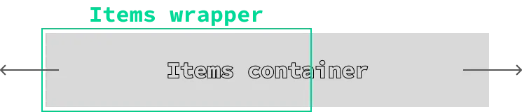
This design gives you flexibility: you can apply custom styles or classes to either container, while the carousel logic is preserved.
Carousel.Items Props
Section titled “Carousel.Items Props”| Prop Name | Type | Default | Description |
|---|---|---|---|
style | JSX.CSSProperties | {} | Inline styles applied to the wrapper container. |
itemsContainerStyle | JSX.CSSProperties | {} | Inline styles applied to the inner items container. |
class | string | "" | CSS classes applied to the wrapper container. |
itemsContainerClass | string | "" | CSS classes applied to the inner items container. |
Container animation
Section titled “Container animation”The items container uses a transform transition with a default duration of 0.2s. You can override this behavior by providing your own transition or disabling it entirely.
This can be done by applying a custom class or inline style through the itemsContainerStyle or itemsContainerClass props.
For example:
// Increase the transition duration when switching items<Carousel.Items itemsContainerStyle={{ transition: 'transform 0.5s' }} />
// Completely disable the transition<Carousel.Items itemsContainerStyle={{ transition: 'none' }} />
Carousel.Item
Section titled “Carousel.Item”The Carousel.Item component defines a single item inside the Carousel.Items container. Each Carousel.Item represents one element in the carousel - this could be an image, a card, or any other type of content you’d like to showcase.
Carousel.Item Props
Section titled “Carousel.Item Props”| Prop Name | Type | Default | Description |
|---|---|---|---|
style | JSX.CSSProperties | {} | Inline styles applied directly to the carousel item element. |
style-selected | JSX.CSSProperties | {} | Inline styles applied when the item is marked as selected. |
class | string | "" | Additional CSS classes applied to the carousel item element. |
class-selected | string | "" | Additional CSS classes applied when the item is selected. |
selected | boolean | false | Marks the item as the currently selected one. |
<Carousel style={{ width: '30vmax' }} itemWidth={30} itemGap={10} itemsAlignment='center'> <Carousel.Items style={{ height: '80%' }}> <Carousel.Item>Item 1</Carousel.Item> <Carousel.Item selected style-selected={{ transform: 'scale(1.1)' }}>Item 2</Carousel.Item> <Carousel.Item>Item 3</Carousel.Item> <Carousel.Item>Item 4</Carousel.Item> </Carousel.Items> <Carousel.Pagination /></Carousel>In this example, the second item is automatically positioned in the center of the carousel, marked as selected, and scaled up by 1.1 of its original size.
Carousel.Pagination
Section titled “Carousel.Pagination”
The Carousel.Pagination component renders pagination controls, allowing users to navigate through carousel items via buttons or indicators. Under the hood, it uses the Pagination component, so you can leverage the same props and slots to fully customize its behavior and appearance.
You can place Carousel.Pagination anywhere inside the Carousel. It automatically syncs with the carousel’s active page and items. Styling and additional classes can be applied via the style and class props.
To customize the behavior of pagination items or controls, you can use the Carousel.Pagination.Item and Carousel.Pagination.Controls slots. For instance, you can design your own buttons, indicators, or even disable them entirely.
Carousel.Next/Carousel.Prev
Section titled “Carousel.Next/Carousel.Prev”
The Carousel.Next and Carousel.Prev components provide custom navigation controls for the carousel. They let users move forward or backward through the carousel items with a simple click.
These components can be placed anywhere inside the Carousel and will automatically sync with the carousel’s active page and items. You can also customize their appearance by adding text, icons, or any other elements inside them.
| Prop Name | Type | Default | Description |
|---|---|---|---|
style | JSX.CSSProperties | {} | Inline styles applied directly to the next/prev button element. |
class | string | "" | Additional CSS classes for the next/prev button element. |
class-disabled | string | "" | Additional CSS classes applied when the button is disabled. Buttons are disabled automatically if there are no more items to scroll left or right. |
children | JSX.Element | undefined | Content rendered inside the button. Can be an icon, text, or any element. Defaults to an arrow icon if no content is provided. |
<Carousel style={{ width: '30vmax' }} itemWidth={30} itemGap={10} itemsAlignment='center'> <Carousel.Items style={{ height: '80%' }}> <Carousel.Item>Item 1</Carousel.Item> <Carousel.Item selected style-selected={{ transform: 'scale(1.1)' }}>Item 2</Carousel.Item> <Carousel.Item>Item 3</Carousel.Item> <Carousel.Item>Item 4</Carousel.Item> </Carousel.Items> <Flex direction='row' align-items='center'> <Flex direction='row'> <Carousel.Prev /> <Carousel.Next /> </Flex> <Carousel.Pagination > <Carousel.Pagination.Control style={{ display: 'none' }} /> </Carousel.Pagination> </Flex></Carousel>In this example, the default pagination controls are hidden and replaced with the Carousel.Prev and Carousel.Next buttons. Both buttons are placed next to the pagination, allowing users to navigate between carousel items manually.
To use the Carousel component effectively, start by defining your goals - how you want the items to appear and behave. The Carousel is designed to be flexible, so its configuration depends on whether you want to highlight individual items or focus on the entire group.
The following considerations will help you set it up:
- Item vs. group focus: Use the
groupItemsprop to decide whether the emphasis should be on a single selected item or the entire collection. - Leading and trailing space: Control extra spacing at the start and end with the
leadingAndTrailingSpacesprop. Setting it tofalseremoves the side padding, creating a more compact layout. - Size and spacing: Adjust
itemWidthanditemGapto define item dimensions and spacing. - Alignment: Use
itemsAlignment(start,center, orend) to control how items are aligned inside the carousel. - Navigation: Choose between the built-in pagination (
Carousel.Pagination) or custom navigation controls (Carousel.Next and Carousel.Prev).
The following sections illustrate different approaches based on these options.
Highlighting a Selected Item
Section titled “Highlighting a Selected Item”When you want to emphasize the active item, leave groupItems={false} or omit it. This allows you to style individual items when they are selected using the style-selected or class-selected props of Carousel.Item.
In the example below, each item takes up 40% width with a 5% gap, and the active item is centered (itemsAlignment="center").
import { For } from 'solid-js';import Flex from '@components/Layout/Flex/Flex';import Carousel from '@components/Complex/Carousel/Carousel';
const App = () => {    const items = ['Item 1', 'Item 2', 'Item 3', 'Item 4', 'Item 5'];
    return (        <Carousel style={{ width: '30vmax' }} itemWidth={40} itemGap={5} itemsAlignment='center'>            <Carousel.Items style={{ height: '80%' }}>                <For each={items}>                    {(item) =>                        <Carousel.Item                            style={{ overflow: 'hidden', transition: 'transform 300ms', 'border-radius': '1vmax' }}                        >                            <Flex align-items='center' justify-content='center' style={{ background: '#3e3d5d', height: '100%' }}>                                {item}                            </Flex>                        </Carousel.Item>}                </For>            </Carousel.Items>            <Carousel.Pagination />        </Carousel>    );};
export default App;
To make the selected item stand out, add custom styles via style-selected:
12 collapsed lines
import { For } from 'solid-js';import Flex from '@components/Layout/Flex/Flex';import Carousel from '@components/Complex/Carousel/Carousel';
const App = () => { const items = ['Item 1', 'Item 2', 'Item 3', 'Item 4', 'Item 5'];
return ( <Carousel style={{ width: '30vmax' }} itemWidth={40} itemGap={5} itemsAlignment='center'> <Carousel.Items style={{ height: '80%' }}> <For each={items}> {(item) => <Carousel.Item style-selected={{ transform: 'scale(1.1)', border: '0.2vmax solid #868599' }} style={{ overflow: 'hidden', transition: 'transform 300ms', 'border-radius': '1vmax' }} >12 collapsed lines
<Flex align-items='center' justify-content='center' style={{ background: '#3e3d5d', height: '100%' }}> {item} </Flex> </Carousel.Item>} </For> </Carousel.Items> <Carousel.Pagination /> </Carousel> );};
export default App;Removing leading and trailing spaces
Section titled “Removing leading and trailing spaces”By default, the Carousel component adds extra spacing before the first item and after the last one. This helps create a more open layout with padding on the sides. If you’d rather have a compact layout without these side gaps, you can disable this behavior by setting the leadingAndTrailingSpaces prop to false.
8 collapsed lines
import { For } from 'solid-js';import Flex from '@components/Layout/Flex/Flex';import Carousel from '@components/Complex/Carousel/Carousel';
const App = () => { const items = ['Item 1', 'Item 2', 'Item 3', 'Item 4', 'Item 5'];
return ( <Carousel style={{ width: '30vmax' }} itemWidth={40} itemGap={5} leadingAndTrailingSpaces={false} itemsAlignment='center'>19 collapsed lines
<Carousel.Items style={{ height: '80%' }}> <For each={items}> {(item) => <Carousel.Item style-selected={{ transform: 'scale(1.1)', border: '0.2vmax solid #868599' }} style={{ overflow: 'hidden', transition: 'transform 300ms', 'border-radius': '1vmax' }} > <Flex align-items='center' justify-content='center' style={{ background: '#3e3d5d', height: '100%' }}> {item} </Flex> </Carousel.Item>} </For> </Carousel.Items> <Carousel.Pagination /> </Carousel> );};
export default App;Align items differently
Section titled “Align items differently”You can also control how items are aligned within the carousel using the itemsAlignment prop. Setting it to start or end shifts the items accordingly, giving the carousel a different visual flow.
itemsAlignment=‘start’
itemsAlignment=‘end’
Page like display of items
Section titled “Page like display of items”For a page-like experience, use the groupItems prop. When enabled, items are grouped together based on the defined itemWidth and itemGap. Navigation will then move one group at a time instead of a single item.
Creating custom controls
Section titled “Creating custom controls”If you’d like to replace the default navigation buttons, you can use the Carousel.Next and Carousel.Prev components to build your own controls. You can also override or hide the built-in pagination buttons by customizing the Carousel.Pagination.Controls slot.
19 collapsed lines
import { For } from 'solid-js';import Flex from '@components/Layout/Flex/Flex';import Carousel from '@components/Complex/Carousel/Carousel';
const App = () => { const items = ['Item 1', 'Item 2', 'Item 3', 'Item 4', 'Item 5'];
return ( <Carousel style={{ width: '30vmax' }} itemWidth={40} itemGap={5} itemsAlignment='center'> <Carousel.Items style={{ height: '80%' }}> <For each={items}> {(item) => <Carousel.Item style-selected={{ transform: 'scale(1.1)', border: '0.2vmax solid #868599' }} style={{ overflow: 'hidden', transition: 'transform 300ms', "border-radius": '1vmax' }}> <Flex align-items='center' justify-content='center' style={{ background: '#3e3d5d', height: '100%' }}> {item} </Flex> </Carousel.Item>} </For> </Carousel.Items> <Flex style={{ width: '100%' }} direction='row' justify-content='space-between'> <Flex direction='row'> <Carousel.Prev /> <Carousel.Next /> </Flex> <Carousel.Pagination > <Carousel.Pagination.Control style={{ display: 'none' }}></Carousel.Pagination.Control> </Carousel.Pagination> </Flex> </Carousel>4 collapsed lines
);};
export default App;Adding custom scrolling behavior
Section titled “Adding custom scrolling behavior”You can also control the carousel programmatically using a CarouselRef in combination with next and prev methods that lets you scroll to the next or previous item.
With this approach, you can add custom navigation logic - for example, scrolling when certain keyboard keys are pressed, or when the user scrolls the mouse wheel.
Scrolling with the mouse wheel
Section titled “Scrolling with the mouse wheel”To enable mouse wheel scrolling, simply listen for the wheel event on the carousel element and call ref.next() or ref.prev() depending on the scroll direction.
4 collapsed lines
import { For } from 'solid-js';import Flex from '@components/Layout/Flex/Flex';import Carousel, { CarouselRef } from '@components/Complex/Carousel/Carousel';
const App = () => { const items = ['Item 1', 'Item 2', 'Item 3', 'Item 4', 'Item 5']; let ref!: CarouselRef;
const scrollCarousel = (event: WheelEvent) => { event.preventDefault(); event.deltaY > 0 ? ref.next() : ref.prev() };
return ( <Carousel ref={ref} wheel={scrollCarousel} style={{ width: '30vmax' }} itemWidth={40} itemGap={5} itemsAlignment='center'> <Carousel.Items style={{ height: '80%' }}>18 collapsed lines
<For each={items}> {(item) => <Carousel.Item style-selected={{ transform: 'scale(1.1)', border: '0.2vmax solid #868599' }} style={{ overflow: 'hidden', transition: 'transform 300ms', "border-radius": '1vmax' }} > <Flex align-items='center' justify-content='center' style={{ background: '#3e3d5d', height: '100%' }}> {item} </Flex> </Carousel.Item>} </For> </Carousel.Items> <Carousel.Pagination /> </Carousel> );};
export default App;Keyboard arrow keys scrolling
Section titled “Keyboard arrow keys scrolling”You can also navigate the carousel using the keyboard’s arrow keys. Simply add a keydown listener and call the next or prev methods depending on which key is pressed.
4 collapsed lines
import { For, onMount, onCleanup } from 'solid-js';import Flex from '@components/Layout/Flex/Flex';import Carousel, { CarouselRef } from '@components/Complex/Carousel/Carousel';
const App = () => { const items = ['Item 1', 'Item 2', 'Item 3', 'Item 4', 'Item 5']; let ref!: CarouselRef;
const scrollCarouselWithKey = (event: KeyboardEvent) => { event.preventDefault(); event.keyCode === 39 ? ref.next() : event.keyCode === 37 ? ref.prev() : null; };
onMount(() => { document.addEventListener('keydown', scrollCarouselWithKey); });
onCleanup(() => { document.removeEventListener('keydown', scrollCarouselWithKey); });
return ( <Carousel ref={ref} style={{ width: '30vmax' }} itemWidth={40} itemGap={5} itemsAlignment='center'> <Carousel.Items style={{ height: '80%' }}>16 collapsed lines
<For each={items}> {(item) => <Carousel.Item style-selected={{ transform: 'scale(1.1)', border: '0.2vmax solid #868599' }} style={{ overflow: 'hidden', transition: 'transform 300ms', "border-radius": '1vmax' }} > <Flex align-items='center' justify-content='center' style={{ background: '#3e3d5d', height: '100%' }}> {item} </Flex> </Carousel.Item>} </For> </Carousel.Items> <Carousel.Pagination /> </Carousel> );};
export default App;Continuous scrolling while holding down
Section titled “Continuous scrolling while holding down”You can also enable continuous scrolling when a button is held down. To achieve this:
- Use custom controls with
Carousel.NextandCarousel.Prev.- Pass empty
clickhandlers to disable their default behavior.
- Pass empty
- Create a function that repeatedly triggers scrolling while the button is held.
- Use
setTimeoutfor the initial delay andsetIntervalfor continuous scrolling.
- Use
- Add a
mouseuplistener to stop the scroll when the button is released.
import { For, onMount, onCleanup } from 'solid-js';import Flex from '@components/Layout/Flex/Flex';import Carousel, { CarouselRef } from '@components/Complex/Carousel/Carousel';
const App = () => {    const items = ['Item 1', 'Item 2', 'Item 3', 'Item 4', 'Item 5'];    let ref!: CarouselRef;    let bounceTimeout: any, bounceInterval: any;
   const bounce = (scrollCarouselCallback: () => void) => {        return () => {            scrollCarouselCallback();            // Add event listener for mouseup to stop the continuous scrolling            document.addEventListener('mouseup', clearTimers, { once: true });            // Clear any existing timeouts or intervals            clearTimers();
            bounceTimeout = setTimeout(() => {                bounceInterval = setInterval(() => {                    scrollCarouselCallback();                }, 100);            }, 200)        }    }
    const clearTimers = () => {        if (bounceTimeout) {            clearTimeout(bounceTimeout);            bounceTimeout = null;        }
        if (bounceInterval) {            clearInterval(bounceInterval);            bounceInterval = null;        }    }
    return (        <Carousel ref={ref} style={{ width: '30vmax' }} itemWidth={40} itemGap={5} itemsAlignment='center'>            <Carousel.Items style={{ height: '80%' }}>                <For each={items}>                    {(item) => <Carousel.Item                        style-selected={{ transform: 'scale(1.1)', border: '0.2vmax solid #868599' }}                        style={{ overflow: 'hidden', transition: 'transform 300ms', "border-radius": '1vmax' }}>                        <Flex align-items='center' justify-content='center' style={{ background: '#3e3d5d', height: '100%' }}>                            {item}                        </Flex>                    </Carousel.Item>}                </For>            </Carousel.Items>            <Flex style={{ width: '100%' }} direction='row' justify-content='space-between'>                <Flex direction='row'>                    <Carousel.Prev click={() => { }} mousedown={bounce(() => ref.prev())} />                    <Carousel.Next click={() => { }} mousedown={bounce(() => ref.next())} />                </Flex>                <Carousel.Pagination >                    <Carousel.Pagination.Control style={{ display: 'none' }}></Carousel.Pagination.Control>                </Carousel.Pagination>            </Flex>        </Carousel>    );};
export default App;
Extending the Carousel With Navigation 2.0.0
Section titled “Extending the Carousel With Navigation ”2.0.0The Carousel component is highly adaptable and can be integrated with the Navigation system to support various keyboard and button inputs.
Depending on your UI’s depth, you might want the carousel to react globally to certain inputs or strictly only when it is in focus.
The following examples demonstrate two common patterns for integrating the Carousel with the Navigation system.
Pattern A: Tab-style
Section titled “Pattern A: Tab-style”This approach is perfect for “Top-level” carousels, such as main menu categories or shop tabs. In this scenario, we want specific buttons (like Shoulder Buttons or Q/E) to control the carousel regardless of where the focus is.
import Carousel, { CarouselRef } from '@components/Complex/Carousel/Carousel';import Navigation from '@components/Utility/Navigation/Navigation';import { ActionMap } from '@components/Utility/Navigation/types';
const App = () => {    // Declare carousel ref    let carouselRef!: CarouselRef;
    // Define actions for shifting tabs    const customActions: ActionMap = {        'carousel-prev': {            key: { binds: ['Q'], type: ['press', 'hold'] },            button: { binds: ['left-shoulder'], type: 'hold' },            callback: () => carouselRef.prev()        },        'carousel-next': {            key: { binds: ['E'], type: ['press', 'hold'] },            button: { binds: ['right-shoulder'], type: 'hold' },            callback: () => carouselRef.next()        },    };
    return (        // Provide actions to the Navigation component and attach ref to carousel        <Navigation actions={customActions}>            <Carousel ref={carouselRef}>                {/* Carousel content */}            </Carousel>        </Navigation>    );}
Pattern B: Scoped Directional Control (onAction)
Section titled “Pattern B: Scoped Directional Control (onAction)”This pattern is ideal for nested carousels or lists (like a character selection screen). By using the built-in onAction prop,
the carousel only responds to Arrow Keys or the D-Pad when its element is explicitly focused. This prevents “input bleeding,” where one button press accidentally moves multiple menus on the same page.
import Carousel, { CarouselRef } from '@components/Complex/Carousel/Carousel';import Navigation from '@components/Utility/Navigation/Navigation';import { ActionMap } from '@components/Utility/Navigation/types';
const App = () => {    // Declare carousel ref    let carouselRef!: CarouselRef;
    // Initialize: Store the API and focus the element    const initCarouselRef = (api: CarouselRef) => {        carouselRef = api;        api.element.focus(); // Must be focused to receive 'move' actions    }
    return (        <Navigation>            <Carousel                ref={initCarouselRef}                // Use the onAction prop to handle directional input when the carousel is focused                onAction={{                    'move-left': () => carouselRef.prev(),                    'move-right': () => carouselRef.next(),                }}            >                {/* Carousel content */}            </Carousel>        </Navigation>    );}
Key Considerations
Section titled “Key Considerations”- Differences: Custom actions (Pattern A) are excellent for high-level navigation that should always be available and doesn’t rely on the element to be focused. Scoped actions (Pattern B) provide finer control, ensuring that directional inputs only affect the carousel the user is currently interacting with.
- Managing Focus: When using
onAction, remember that the Carousel’s element should be focused. - Input Flexibility: You are not limited to these two patterns. Because the
Navigationsystem and theCarouselRefare decoupled, you can mix and match these approaches—for example, using LB/RB for fast-paging while using the D-Pad for precise single-item movement.