

Radial Menu
The RadialMenu component is an interactive circular menu designed for quick selection among multiple options arranged radially around a center point.
It supports mouse and controller input, visual indicators, and customizable slice spacing, making it ideal for in-game weapon wheels, tool selectors, or compact UI menus.
To use the Radial-menu component, simply import it and include it in your JSX. You can customize it with various props and slots to suit your specific requirements.
8 collapsed lines
// Assets importimport Weapon1 from "@assets/wheel/weapon1.png";import Weapon2 from "@assets/wheel/weapon2.png";import Weapon3 from "@assets/wheel/weapon3.png";import Weapon4 from "@assets/wheel/weapon4.png";import Weapon5 from "@assets/wheel/weapon5.png";import Weapon6 from "@assets/wheel/weapon6.png";import Center from "@assets/wheel/GameMessage_AchievmentIcon.png";import { For } from 'solid-js';import RadialMenu from "@components/Complex/RadialMenu/RadialMenu";import BackgroundImage from "@components/Media/BackgroundImage/BackgroundImage";
const wheelItems = [ { id: "shotgun", img: Weapon1 }, { id: "pistol", img: Weapon2 }, { id: "rifle", img: Weapon3 }, { id: "sniper", img: Weapon4 }, { id: "smg", img: Weapon5 }, { id: "grenade", img: Weapon6 },]const App = () => { return ( <RadialMenu opened> <RadialMenu.Content style={{width: '50%', height: '50%'}}> <BackgroundImage style={{width: '80%', height: '80%'}} src={Center} options={{size: 'contain', position: "center" }} /> </RadialMenu.Content> <For each={wheelItems}> {(item) => ( <RadialMenu.Item id={item.id}> <div style={{ width: '5vmax', height: '5vmax' }}> <BackgroundImage fill src={item.img} options={{size: 'contain', position: "center" }} /> </div> </RadialMenu.Item> )} </For> </RadialMenu> );};
export default App;RadialMenu Props
Section titled “RadialMenu Props”| Prop Name | Type | Default | Description |
|---|---|---|---|
style | JSX.CSSProperties | {} | Inline styles to apply directly to the radial menu’s root element. |
class | string | "" | Additional CSS classes to apply to the radial menu’s root element. |
ref | RadialMenuRef | undefined | undefined | A reference to the component, providing access to its methods and the underlying HTML element. |
opened | boolean | false | Controls whether the radial menu is initially open and interactive. When false, input handling and visual updates are paused. |
gap | number | 0 | Defines the spacing between adjacent slices of the menu, expressed as a percentage of the radius. A larger value increases the visual separation between items. |
selected | number | 0 | The index of the initially selected item in the menu. |
onChange | (id: string | number) => void | undefined | Callback triggered when a new item becomes selected. Returns either the item’s id (if defined) or its index. |
onItemChanged | () => void | undefined | Callback executed when the number or order of menu items changes (e.g., due to re-rendering or dynamic updates). |
onAction | Record<string, (scope?: string, ...args: any[]) => void> | undefined | Allows you to add custom navigation action handlers to the radial menu. See the Navigation component documentation for details. |
anchor | string | HTMLElement | undefined | Links navigation to another element. When the anchor element is focused, the radial menu’s actions will execute. Can be a CSS selector or HTMLElement. |
Ref API
Section titled “Ref API”To interact with the RadialMenu programmatically, you can use the RadialMenuRef interface. This interface provides access to the component’s root element and exposes methods for controlling its state and selection.
Properties
Section titled “Properties”| Property | Type | Description |
|---|---|---|
element | HTMLDivElement | A reference to the radial menu’s root HTML element, useful for direct DOM access or styling. |
Methods
Section titled “Methods”| Method Name | Parameters | Return Value | Description |
|---|---|---|---|
open | None | void | Opens the radial menu, enabling input handling and rendering active selection states. |
close | None | void | Closes the radial menu, disabling input tracking and freezing the current selection. |
opened | None | boolean | Returns the current visibility state of the component. |
changeGap | value: number | void | Dynamically adjusts the spacing between slices, allowing smooth transitions or effects that depend on menu density. |
selectByIndex | index: number | void | Selects a menu item by its zero-based index. Triggers the onChange event if the selection changes. |
selectByVector | x: number, y: number | void | Selects a menu item based on normalized vector coordinates (range -1 to 1), useful for controller or joystick input. Includes an internal deadzone for stable selection. |
The RadialMenu component exposes multiple slots that allow you to customize its structure, visuals, and behavior:
- RadialMenu.Item - Defines an individual slice (menu option) displayed around the wheel.
- RadialMenu.Selector - Visual layer for the colored wedge of each item, representing its selected state.
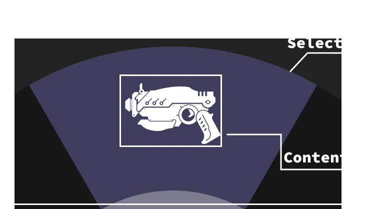
- RadialMenu.Content - Container for the central content of the menu (e.g., icons, labels, or contextual info).
- RadialMenu.Indicator - Represents the rotating half-arc that highlights the currently selected item or follows cursor/controller movement.
- RadialMenu.Icon - Optional element positioned at the center of the
Indicator, can be used to display an icon or pointer.
RadialMenu.Item
Section titled “RadialMenu.Item”The RadialMenu.Item slot defines a single slice (menu option) within the radial menu. Each RadialMenu.Item you render creates one slice in the wheel.
<RadialMenu opened> <RadialMenu.Item offset="2vmax" style={{transition: 'transform 0.2s linear'}} style-selected={{ transform: 'scale(1.1)' }} > <div style={{ width: '5vmax', height: '5vmax' }}> <BackgroundImage fill src={item.img} options={{size: 'contain', position: "center" }} /> </div> </RadialMenu.Item> <RadialMenu.Item offset="2vmax" style={{transition: 'transform 0.2s linear'}} style-selected={{ transform: 'scale(1.1)' }} > <div style={{ width: '5vmax', height: '5vmax', 'background-color': 'aqua' }}></div> </RadialMenu.Item></RadialMenu>Internal structure (advanced)
Section titled “Internal structure (advanced)”Structurally, each item in the RadialMenu starts as a square element with a border-radius of 50%, effectively turning it into a circle.
The circular shape is then divided into slices using the CSS clip-path property. Each item is clipped to a specific wedge size, determined by the total number of items in the menu.
Once clipped, the slices are evenly rotated around the center, forming the complete radial layout.
Internally, each RadialMenu.Item is composed of three layers that work together to form the visual and interactive slice of the menu:
- Selector - the colored wedge behind the item’s content, visually representing its active or selected state.
- Content - the user-provided content inside the slot (e.g., an icon or label). It remains visually upright through counter-rotation, even as the menu spins.
- Wrapper - the outer container that holds the elements. It manages spacing, transforms, and event handling for the item.
| Prop Name | Type | Default | Description |
|---|---|---|---|
style | JSX.CSSProperties | {} | Inline styles applied to the item’s outer wrapper. |
style-selected | JSX.CSSProperties | {} | Inline styles applied to the item’s outer wrapper only when this item is selected. Useful for scale, glow, or emphasis effects. |
class | string | "" | Additional CSS classes applied to the item’s outer wrapper. |
class-selected | string | "" | Additional CSS classes applied to the item’s outer wrapper only when this item is selected. |
id | string | undefined | Stable identifier emitted by onChange. If omitted, the item’s index is used. |
offset | string | 1vmax | Optional vertical padding (CSS size) that nudges the item’s content toward/away from the ring (e.g., "1vmax"). |
RadialMenu.Selector
Section titled “RadialMenu.Selector”The RadialMenu.Selector slot defines the colored wedge of each RadialMenu.Item.
It serves as the visual slice that fills the area behind the item’s content and represents its active or selected state.
The Selector slot is the main way to customize the appearance and size of each slice.
Adjusting the selector’s border-width controls how thick each wedge appears, while the border-color defines the base color of that slice.
By providing a style-selected or class-selected, you can also control how the selected item visually changes when active.
<RadialMenu opened> <RadialMenu.Selector style={{"border-width": '5vmax', 'border-color': 'rgba(0,0,80, 0.35)'}} style-selected={{'border-color': 'rgb(0,0,80)'}} /> {/* Items */}</RadialMenu>| Prop Name | Type | Default | Description |
|---|---|---|---|
style | JSX.CSSProperties | {} | Inline styles applied directly to the selector wedge. Used to define the base look of each slice. |
style-selected | JSX.CSSProperties | {} | Inline styles applied when the parent item is selected. Use this to visually distinguish the active slice. |
class | string | "" | Additional CSS classes applied to the selector wedge. Used to define the base look of each slice. |
class-selected | string | "" | CSS classes applied when the parent item is selected. Use this to visually distinguish the active slice. |
RadialMenu.Content
Section titled “RadialMenu.Content”The RadialMenu.Content slot represents the inner area of the radial menu — the circular space at its center.
It’s primarily used to display any content that should remain static and upright while the outer slices rotate, such as icons, labels, player stats, or contextual information.
You can place any custom content inside the RadialMenu.Content slot.
This slot remains fixed in the center and doesn’t rotate along with the slices.
<RadialMenu opened> <RadialMenu.Content style={{'background-color': '#333', border: '1vmax solid #3e3d5d'}}> <h3>Weapons</h3> <div>Current weapon info</div> </RadialMenu.Content> {/* Items */}</RadialMenu>| Prop Name | Type | Default | Description |
|---|---|---|---|
style | JSX.CSSProperties | {} | Inline styles applied directly to the content container. |
class | string | "" | Additional CSS classes applied to the content container. |
RadialMenu.Indicator
Section titled “RadialMenu.Indicator”The RadialMenu.Indicator is an optional slot that represents the rotating arc or marker that follows the current selection around the menu.
It visually indicates which slice is active or which direction the user is pointing toward (for example, when using a joystick or mouse).
This slot can also contain an optional RadialMenu.Indicator.Icon, which stays attached to the indicator’s center and rotates alongside it.
To display the indicator simply provide it inside the RadialMenu component.
<RadialMenu> <RadialMenu.Indicator style={{ "border-width": "5vmax", "border-color": "rgba(255,255,255,0.2)" }} /> {/* Items */}</RadialMenu>| Prop Name | Type | Default | Description |
|---|---|---|---|
style | JSX.CSSProperties | {} | Inline styles applied to the indicator arc. |
class | string | "" | Additional CSS classes applied to the indicator arc. |
RadialMenu.Icon
Section titled “RadialMenu.Icon”The RadialMenu.Icon slot is an optional element that appears at the center of the RadialMenu.Indicator.
It’s used to visually represent the pointer or direction of the active slice.
If you don’t provide any children inside the slot, a default arrow-shaped placeholder will be rendered automatically.
This placeholder can be fully customized through the slot’s style and class props.
If you do provide content (e.g., an image or SVG), it will override the default icon and render your custom content instead.
<RadialMenu opened> <RadialMenu.Indicator> <RadialMenu.Indicator.Icon style={{width: '1vmax', height: '1vmax'}}> <Image fill src={CustomIcon} /> </RadialMenu.Indicator.Icon> </RadialMenu.Indicator></RadialMenu>| Prop Name | Type | Default | Description |
|---|---|---|---|
style | JSX.CSSProperties | {} | Inline styles applied directly to the icon or placeholder element. |
class | string | "" | Additional CSS classes applied to the icon or placeholder element. |
Customizing the Selected Item
Section titled “Customizing the Selected Item”You can customize the look of the selected item through the class-selected and style-selected props of either the RadialMenu.Selector or the RadialMenu.Item slots — depending on what you want to modify.
- To change the highlight or color of the selected slice, customize the
RadialMenu.Selector. - To alter the appearance of the entire item (e.g., scale, glow, border), customize the
RadialMenu.Item.
In the following example, the selected item grows slightly larger when selected, and the highlight color changes to a custom shade of blue.
21 collapsed lines
// Assets importimport Weapon1 from "@assets/wheel/weapon1.png";import Weapon2 from "@assets/wheel/weapon2.png";import Weapon3 from "@assets/wheel/weapon3.png";import Weapon4 from "@assets/wheel/weapon4.png";import Weapon5 from "@assets/wheel/weapon5.png";import Weapon6 from "@assets/wheel/weapon6.png";import Center from "@assets/wheel/GameMessage_AchievmentIcon.png";import { For } from 'solid-js';import RadialMenu from "@components/Complex/RadialMenu/RadialMenu";import BackgroundImage from "@components/Media/BackgroundImage/BackgroundImage";
const wheelItems = [ { id: "shotgun", img: Weapon1 }, { id: "pistol", img: Weapon2 }, { id: "rifle", img: Weapon3 }, { id: "sniper", img: Weapon4 }, { id: "smg", img: Weapon5 }, { id: "grenade", img: Weapon6 },]
const App = () => { return ( <RadialMenu opened> <RadialMenu.Content> <BackgroundImage src={Center} options={{size: 'contain', position: "center" }} /> </RadialMenu.Content> <RadialMenu.Indicator /> <RadialMenu.Selector style-selected={{ 'border-color': 'rgba(0, 0, 120, 0.5)' }} /> <For each={wheelItems}> {(item) => ( <RadialMenu.Item id={item.id} style={{transition: 'transform 0.2s linear'}} style-selected={{ transform: 'scale(1.1)' }}> <div style={{ width: '5vmax', height: '5vmax' }}> <BackgroundImage fill src={item.img} options={{size: 'contain', position: "center" }} /> </div> </RadialMenu.Item> )} </For> </RadialMenu> );};
export default App;Reacting to Item Changes
Section titled “Reacting to Item Changes”To handle item selection changes in the RadialMenu, use the onChange prop.
This prop accepts a callback function that receives the id of the newly selected item as its argument.
Displaying the Selected Item in the Center
Section titled “Displaying the Selected Item in the Center”In the following example, we store the currently selected item in a signal and update it whenever the user changes their selection.
The id of the selected item is then displayed inside the RadialMenu.Content slot.
21 collapsed lines
// Assets importimport Weapon1 from "@assets/wheel/weapon1.png";import Weapon2 from "@assets/wheel/weapon2.png";import Weapon3 from "@assets/wheel/weapon3.png";import Weapon4 from "@assets/wheel/weapon4.png";import Weapon5 from "@assets/wheel/weapon5.png";import Weapon6 from "@assets/wheel/weapon6.png";import Center from "@assets/wheel/GameMessage_AchievmentIcon.png";import { For } from 'solid-js';import RadialMenu from "@components/Complex/RadialMenu/RadialMenu";import BackgroundImage from "@components/Media/BackgroundImage/BackgroundImage";
const wheelItems = [ { id: "shotgun", img: Weapon1 }, { id: "pistol", img: Weapon2 }, { id: "rifle", img: Weapon3 }, { id: "sniper", img: Weapon4 }, { id: "smg", img: Weapon5 }, { id: "grenade", img: Weapon6 },]
const App = () => { const [currentItem, setCurrentItem] = createSignal(wheelItems[0]); return ( <RadialMenu opened selected={currentItem()} gap={0.5} onChange={(id) => setCurrentItem(id)}> <RadialMenu.Selector style={{"border-width": '5vmax'}} /> <RadialMenu.Content style={{'background-color': '#333', border: '1vmax solid #3e3d5d'}}> <div style={{'font-size': '1vmax'}}>{`Selected item: ${currentItem()}`}</div> </RadialMenu.Content>15 collapsed lines
<RadialMenu.Indicator /> <For each={wheelItems}> {(item) => ( <RadialMenu.Item id={item.id} offset="0.75vmax" > <div style={{ width: '3.5vmax', height: '3.5vmax' }}> <BackgroundImage fill src={item.img} options={{size: 'contain', position: "center" }} /> </div> </RadialMenu.Item> )} </For> </RadialMenu> );};
export default App;Alternative Selection Methods (programmatic selection)
Section titled “Alternative Selection Methods (programmatic selection)”When the RadialMenu is open, it automatically reacts to mousemove events and continuously tracks the cursor position until it’s closed.
Beyond this default behavior, items can also be selected programmatically in two additional ways:
- Using the
selectByIndexmethod from the component’sref, providing a valid item index. - Using the
selectByVectormethod from the component’sref, providing normalized X and Y values (ranging from -1 to 1). This approach is ideal for mapping to a gamepad stick.
Selecting an item by index
Section titled “Selecting an item by index”To select an item by its index:
- Declare a variable and assign it the
RadialMenuReftype. - Pass that variable to the
refprop of theRadialMenucomponent. - Call
ref.selectByIndex()and provide a valid index as the argument.
In the following example, pressing the keys 1-6 on the keyboard will select the corresponding item in the RadialMenu.
21 collapsed lines
// Assets importimport Weapon1 from "@assets/wheel/weapon1.png";import Weapon2 from "@assets/wheel/weapon2.png";import Weapon3 from "@assets/wheel/weapon3.png";import Weapon4 from "@assets/wheel/weapon4.png";import Weapon5 from "@assets/wheel/weapon5.png";import Weapon6 from "@assets/wheel/weapon6.png";import Center from "@assets/wheel/GameMessage_AchievmentIcon.png";import { For, onCleanup, onMount } from 'solid-js';import BackgroundImage from "@components/Media/BackgroundImage/BackgroundImage";import RadialMenu, { RadialMenuRef } from "@components/Complex/RadialMenu/RadialMenu";
const wheelItems = [ { id: "shotgun", img: Weapon1 }, { id: "pistol", img: Weapon2 }, { id: "rifle", img: Weapon3 }, { id: "sniper", img: Weapon4 }, { id: "smg", img: Weapon5 }, { id: "grenade", img: Weapon6 },]
const App = () => { let ref: RadialMenuRef; const handleKeyPress = (e: KeyboardEvent) => { if (e.key >= "1" && e.key <= "6") { const index = Number(e.key) - 1; // convert '1'..'6' to 0..5 ref!.selectByIndex(index); } }
onMount(() => window.addEventListener("keydown", handleKeyPress)); onCleanup(() => window.removeEventListener("keydown", handleKeyPress));
return ( <RadialMenu ref={ref!} opened selected={2} > <RadialMenu.Content style={{width: '50%', height: '50%'}}>16 collapsed lines
<BackgroundImage style={{width: '80%', height: '80%'}} src={Center} options={{size: 'contain', position: "center" }} /> </RadialMenu.Content> <For each={wheelItems}> {(item) => ( <RadialMenu.Item id={item.id} > <div style={{ width: '5vmax', height: '5vmax', }}> <BackgroundImage fill src={item.img} options={{size: 'contain', position: "center" }} /> </div> </RadialMenu.Item> )} </For> </RadialMenu> );};
export default App;Selecting an item with gamepad stick (by vector)
Section titled “Selecting an item with gamepad stick (by vector)”To select an item using a gamepad stick:
- Declare a variable and assign it the
RadialMenuReftype. - Pass that variable to the
refprop of theRadialMenucomponent. - Call
ref.selectByVector()and provide validxandycoordinates representing the stick direction.
In the following example, each frame reads the coordinates of the right stick and passes them to the RadialMenu to change the active item dynamically.
21 collapsed lines
// Assets importimport Weapon1 from "@assets/wheel/weapon1.png";import Weapon2 from "@assets/wheel/weapon2.png";import Weapon3 from "@assets/wheel/weapon3.png";import Weapon4 from "@assets/wheel/weapon4.png";import Weapon5 from "@assets/wheel/weapon5.png";import Weapon6 from "@assets/wheel/weapon6.png";import Center from "@assets/wheel/GameMessage_AchievmentIcon.png";import { For, onCleanup, onMount } from 'solid-js';import BackgroundImage from "@components/Media/BackgroundImage/BackgroundImage";import RadialMenu, { RadialMenuRef } from "@components/Complex/RadialMenu/RadialMenu";
const wheelItems = [ { id: "shotgun", img: Weapon1 }, { id: "pistol", img: Weapon2 }, { id: "rifle", img: Weapon3 }, { id: "sniper", img: Weapon4 }, { id: "smg", img: Weapon5 }, { id: "grenade", img: Weapon6 },]
const App = () => { let ref: RadialMenuRef; const updateGamepad = () => { const gp = navigator.getGamepads()[0]; if (gp) { const x = gp.axes[2]; // right stick X const y = gp.axes[3]; // right stick Y ref!.selectByVector(x, y); } requestAnimationFrame(updateGamepad); };
onMount(() => requestAnimationFrame(updateGamepad));
return ( <RadialMenu ref={ref!} opened > <RadialMenu.Indicator />14 collapsed lines
<For each={wheelItems}> {(item) => ( <RadialMenu.Item id={item.id} > <div style={{ width: '5vmax', height: '5vmax', }}> <BackgroundImage fill src={item.img} options={{size: 'contain', position: "center" }} /> </div> </RadialMenu.Item> )} </For> </RadialMenu> );};
export default App;Opening and Closing the Menu
Section titled “Opening and Closing the Menu”To control the visibility of the RadialMenu, use the open() and close() methods from its ref.
You can also use the opened signal provided by the component to check its current visibility state.
In the following example, the menu is hidden by default and only opens while the Shift key is being held down.
19 collapsed lines
import Weapon1 from "@assets/wheel/weapon1.png";import Weapon2 from "@assets/wheel/weapon2.png";import Weapon3 from "@assets/wheel/weapon3.png";import Weapon4 from "@assets/wheel/weapon4.png";import Weapon5 from "@assets/wheel/weapon5.png";import Weapon6 from "@assets/wheel/weapon6.png";import Center from "@assets/wheel/GameMessage_AchievmentIcon.png";import { For } from 'solid-js';import RadialMenu, {RadialMenuRef} from "@components/Complex/RadialMenu/RadialMenu";import BackgroundImage from "@components/Media/BackgroundImage/BackgroundImage";
const wheelItems = [ { id: "shotgun", img: Weapon1 }, { id: "pistol", img: Weapon2 }, { id: "rifle", img: Weapon3 }, { id: "sniper", img: Weapon4 }, { id: "smg", img: Weapon5 }, { id: "grenade", img: Weapon6 },]
const App = () => { let ref: RadialMenuRef; const handleKeyDown = (e: KeyboardEvent) => { if (e.keyCode === 16 && !(ref!.opened())) ref!.open(); setPressedKey(e.code); }
const handleKeyUp = (e: KeyboardEvent) => { if (e.keyCode === 16 && ref!.opened()) ref!.close(); setPressedKey(e.code); }
return ( <RadialMenu ref={ref!} gap={1.5}> <RadialMenu.Content style={{'background-color': 'transparent'}} /> <RadialMenu.Indicator style={{'border-color': '#3e3d5d70'}}/> <For each={wheelItems}> {(item) => (12 collapsed lines
<RadialMenu.Item id={item.id} style={{transition: 'transform 0.2s linear'}} style-selected={{ transform: 'scale(1.1)' }}> <div style={{ width: '5vmax', height: '5vmax' }}> <BackgroundImage fill src={item.img} options={{size: 'contain', position: "center" }} /> </div> </RadialMenu.Item> )} </For> </RadialMenu> );};
export default App;Extending the RadialMenu With Navigation 2.0.0
Section titled “Extending the RadialMenu With Navigation ”2.0.0The RadialMenu component integrates seamlessly with the Navigation system to create an intuitive keyboard and gamepad experience.
The following example demonstrates an alternative, more robust approach to the selecting an item with gamepad stick guide and opening and closing the menu guide guides.
We will use the Navigation component’s actions system to:
- Open/close the menu using the SHIFT key (Keyboard) or LB button (Gamepad).
- Use the right joystick for item selection.
- Optimize performance by pausing input listeners when the menu is hidden.
Implementation Steps
Section titled “Implementation Steps”- Make sure the
RadialMenuis a descendant of aNavigationcomponent in your component tree. - Create custom set of actions for opening/closing the menu and selecting items.
- Pass the actions to the
Navigationcomponent via theactionsprop. - Use
resumeActionandpauseActionto manage the joystick polling state.
import RadialMenu, { RadialMenuRef } from '@components/Complex/RadialMenu/RadialMenu';import Navigation, { NavigationRef } from '@components/Utility/Navigation/Navigation';import { ActionMap } from '@components/Utility/Navigation/types';
const HUD = () => {    let navigationRef!: NavigationRef;    let radialMenuRef!: RadialMenuRef;
    const openRadialMenu = () => {        if (radialMenuRef?.opened()) return;
        radialMenuRef?.open();        navigationRef.resumeAction('radial-menu-select')    }
    const closeRadialMenu = () => {        radialMenuRef?.close();        navigationRef.pauseAction('radial-menu-select')    }
    const selectRadialMenuOptions = (scope = '', [x, y]: [number, number]) => {        radialMenuRef?.selectByVector(x, y)    }
    const customActions: ActionMap = {        'open-radial-menu': {            key: {binds: ['SHIFT'], type: ['press']},            button: {binds: ['left-shoulder'], type: 'hold'},            callback: openRadialMenu,        },
        'close-radial-menu': {            key: {binds: ['SHIFT'], type: ['lift']},            button: {binds: ['left-shoulder'], type: 'press'},            callback: closeRadialMenu,        },
        'radial-menu-select': {            button: {binds: ['right.joystick']},            callback: selectRadialMenuOptions,            paused: true, // Start paused to avoid unnecessary calculations        }    };
    return (        <div class={styles.Hud}>            <Navigation actions={customActions} ref={navigationRef}>                <RadialMenu ref={radialMenuRef}>                    {/* RadialMenu content */}                </RadialMenu>            </Navigation>        </div>    )}
Few things to note
Section titled “Few things to note”-
The Release Mechanic: To handle gamepad button releases, we use
holdto open andpressto close. While it may seem counter-intuitive, thepresstype fires specifically when the button is released after being held, ensuring the menu stays visible exactly as long as the user maintains pressure on the shoulder button. -
Performance Optimization: Since gamepad joysticks are polled very frequently, the
radial-menu-selectaction is marked aspaused: trueby default. We only resume it while the menu is active to eliminate unnecessary logic overhead when its not used.